A few days ago, I promised the “Business and Marketing Skills For Therapists” group on Facebook a report on my first order from VistaPrint.
A description follows, and photographs are below.
Background.
I’ve been designing my own marketing material for some years, now, but whilst some of the paper one can obtain from Staples, PC World etc is of very good quality, some of the features of the media is lacking.
For example, glossy paper can only be printed on one side (print on the other side and the ink literally slides slowly off the paper as the print comes out of the ink jet printer!), heavyweight paper (280gsm) is reasonable for Rack Cards, but the equivalent in business cards feels a little flimsy and wrong.
The Project!
Use VistaPrint to upload my own designs, following their guidelines to the letter, take advantage of their many special offers, and see what things are like when I open the box upon arrival.
Conclusion.
I’m 90% happy.
Costs ended up as feeling reasonable – I was advised by a colleague to order the items but not pay for them – and wait for at least three offers of discounts by email. In doing so I paid around £60 and saved around £150 – however, I’m not entirely convinced that these marketing items would have been worth £210 – suggesting to me that VistaPrint may artificially inflate their prices in order to give discounts. Just my opinion.
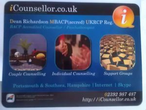
| Positive: | All the items “feel” right & (mostly) look right. Colours look wonderful on most things and the “feel” of the items are what I’d expect when I pick them up (one gets a sense of something as being “cheap” or “quality” by their feel, and I get a “90%” feel of quality with all the items). |
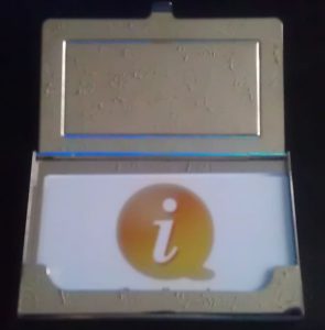
| Negative: | Foil: I choose to have “foil” business cards (which adds a layer of shiny metallic to areas of your card). VistaPrint says: “When any colour ink is applied over the foil it creates a brilliant highlighting effect that seems to change colour. Your cards are distinctive and your designs really stand out.” However, whilst the foil does make the card look “oooh shiny” it has also dulled the colour of my logo to the point of being drab. I use highlights and gradients in my logo and the foil layer washes these subtleties away. Packaging: VistaPrint wrapped most “multiple” item (eg 250 business cards) with a plastic band, and put every “banded” collection in an oblong box along with the mug wrapped in cardboard and the business cards in a separate box. They added a couple of “air bags” to supposedly protect the items. No way did this protect any of the items and the box bounced and rattled its way to my home. Most of the items (eg postcards) have a slightly “damaged” feel to the edges – which may have been caused by the packaging, or may have been caused by a not-very-sharp cutting tool when it came off the printing press. |
What would have made me 100% happy?
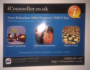
- Sharply cut, neat edges on postcards and rack cards.
- My business card’s “foiled” logo being as brilliantly coloured as on all the other items.
- Professional packaging to protect all the items.
Photographs.
(Click the image to show larger version)
VistaPrint can be found at http://www.VistaPrint.co.uk/


